Freedom of Expression Outside Of Any Box
In a world of templates and algorithms, I believe in breaking free from the conventional. My approach to design isn’t just about making things look good—it’s about challenging the status quo and pushing the boundaries of what’s possible. I view every blank canvas as an opportunity to question established norms and create something that doesn’t just catch the eye, but captures the imagination.
My journey spans the full spectrum of digital creation, from crafting memorable brand identities to architecting intuitive user experiences for web and mobile applications. Through audiovisual studio work, video production, creative writing, and 3D animation, I blur the lines between traditional and digital art, creating immersive experiences that challenge perceptions and engage audiences on multiple levels.
Freedom of expression isn’t just a philosophy—it’s a practical approach that leads to better solutions. When we free ourselves from preconceptions about what design “should” be, we open doors to what it could be. This mindset has led me to develop unique solutions that don’t just meet client needs but exceed their expectations by venturing into unexplored territory. Because in today’s rapidly evolving digital landscape, the most dangerous thing we can do is play it safe.
A Sampling of My Work
-
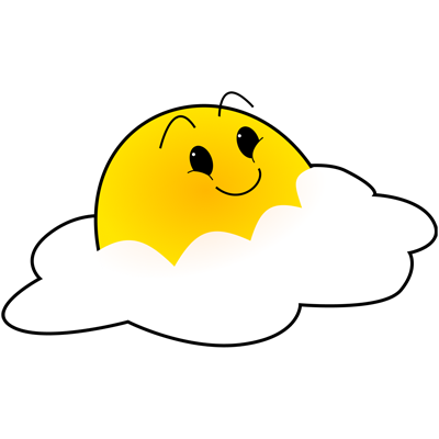
Logo for Jakie's Place, a fictional app/web presence for a diner-style restaurant run by my then-11 year old son
-
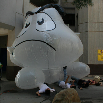
Little Goomba, made big by clear plastic tarp, black garbage bags, white plastic shopping bags, and duct tape. Undergrad, 2007. 2 stories tall, inflated by two shop-vacs on reverse.
-
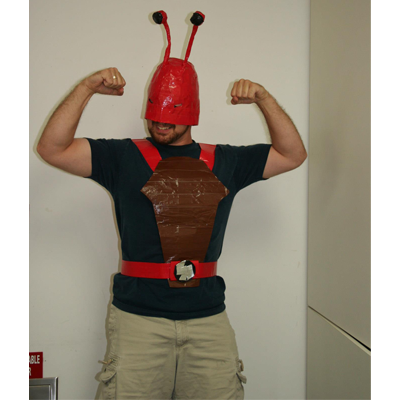
Lobster-Man, made with colored duct tape, foil tape, and baling wire. Project prompt was "make a piece of clothing out of tape". Undergrad, 2007.
-
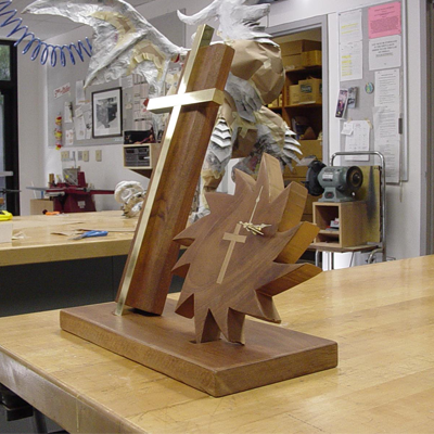
"Time in the Son", mahogany and brass bar. My first time working in a wood shop. Prompt was "upsize an item you already own". Undergrad 2007.
-
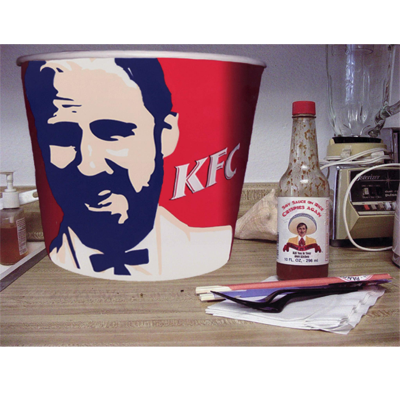
"Kung Fu Crud", Adobe Illustrator. This was a DVD menu screen for my kung fu class, with a picture of Sifu Ken Adams in place of Col. Sanders. Lots of little nods to movie lines over the years. 2011.
-
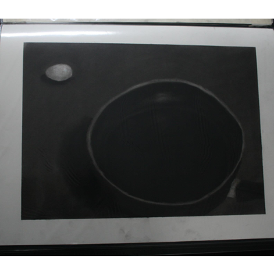
"Looming", charcoal on paper. I was imagining the scene in Star Wars (and later, Spaceballs) where the tiny little spaceship was being chased by the giant star cruiser, and came up with the egg being crept up on by the skillet. Undergrad 2007.
-
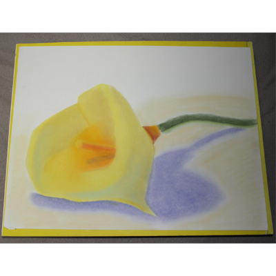
"Lily", pastels on paper. My second try at a color study. I enjoyed working with pastels, but haven't had the time to mess about with them in ages. Undergrad, 2007.
-
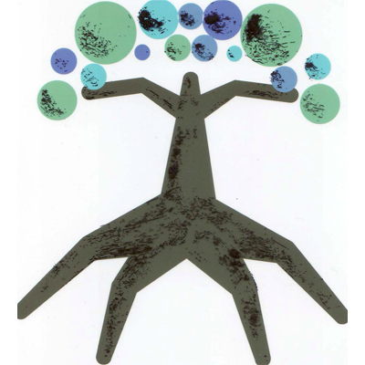
"Summer", Adobe Illustrator on paper and transparency, number two of a series of four. The series was to exemplify the changes of life -- the first, "Spring", was a tree made of colored pasta on a paper plate, to represent the excitement and lack of expectations of youth. "Summer" represents feeling the need to fit in, to do things the way everyone else does them, in the teenage and young twenties. The transparency is the only part showing the shadows in the tree.
-
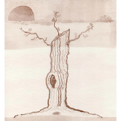
"Winter", number four of four in a series. Painted in hot tea for a sepia tone. Unlike "Summer", the lines are unabashedly shaky and real. Meant to be more natural, with no reason or desire to hide what it is -- a dying tree.
-
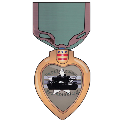
"Medal of Honor", Adobe Illustrator and Photoshop, from a poster for Battleground Pro Wrestling.
-
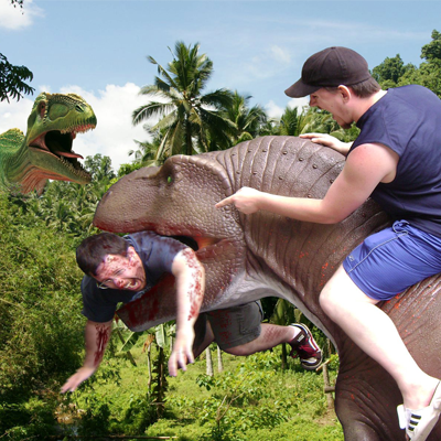
"Dino Fun", Adobe Photoshop. The only things that are physically real in this picture are me, my friend Nick, and the plastic dino head that we found at a "They're Alive!!!" display at the Cleveland Zoo. No Ants were harmed in the making of this scene. 2011.
-
Adobe Illustrator and Figma. Logo for Kitchen Scouts, one of my Google UX Design concepts. 2023.
-
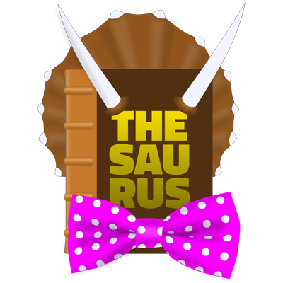
Figma. My first personal brand. "Find the best way to say it, with TheSaurus." It was a creative writing gig that called upon my sense of humor. The pink bowtie with the polka dots has become somewhat of a call-sign for me. 2023.
Find Me at These Freelance Websites:
- Fiverr
- Upwork
